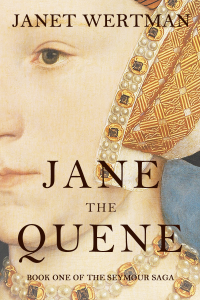

The Rundown
The Recommendation
The Rating
The Links
The Reviewer
Renee Miller
Visit Renee Miller‘s website.They say you can’t judge a book by its cover, but let’s face it, people DO judge it exactly that way. Your book’s cover is its packaging. It’s often the first promotional element your readers see. As such, you should want to make it the best damn packaging possible. It’s what separates your book from all the other books out there. It should say, “Hey, reader, I’m the book you want. Forget about these other jokers. Take me to your bed and let’s hold each other all night long. LOVE ME.”
Designing book covers is an art, but it also takes a dash of business savvy. Why? Because you have to design while thinking about what the consumer will be drawn to. What will entice them into clicking “buy”? If you have skill in this area, there’s nothing wrong with designing your own cover. Sites like DeviantArt and Fotolia offer beautiful images you can purchase the rights to use without putting yourself in the poorer house, so you don’t have to be a brilliant photographer or artist, and photo editing/design sites like Canva or PicMonkey (among others) offer free (and paid) tools to help even the most hopeless author design a beautiful cover.
However, don’t be afraid to hire professional help. In fact, I encourage you to do so if you’re not experienced with cover design. Seriously. Do it. It’s worth the money.
Keep in mind, though, that even if you hire a professional to design your book cover, it’s not guaranteed you’ll achieve book cover excellence. Most designers have a good eye for what works and what doesn’t, but the bottom line is you control what you receive in the end. After all, he or she has to design it to your specifications.
Occasionally, although I hope not often, you may also hire a designer who is kind of shitty at what he or she does. In these situations, your final product can be… disappointing.
So, first of all, I want to tell you NOT to pay for a cover you don’t love. You must LOVE it. In fact, I’d recommend you avoid paying anything until you see a final product. Yes, you must pay before the designer sends you the final files, but you should at least see and approve a proof before giving payment. If you don’t like it, tell the designer. Don’t just say “I guess it’ll do.” This is YOUR book. YOUR money. Make sure you’re getting what you want.
There. That’s taken care of. Let’s discuss how to ensure you get a damn fine cover for your marvelous masterpiece.
Title
Make sure the title is easy to read, particularly when in thumbnail view. Many people search for your book online, and often it’s on a phone or tablet, where the cover image is in thumbnail size. This means it’s small. The title should still be readable. The elements of the cover, such as the images and colors, should also be visible in thumbnail view. If they’re not, keep working on it.
Color and Artwork
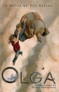
Unless you’re an artist, you should generally avoid using your own art. This is almost always a terrible idea and can make your book the object of humor, rather than attract readers. Unless of course the book is comedy, and the goal is to make readers laugh at it. In all other cases, laughing is bad.
When choosing images and font colors, pay attention to the overall effect. Too many bright, garish colors in one place can be a turnoff, but not always. It’s art, after all. Someone will love it. Don’t count on that, though. Choose colors that work together, and help each other pop. Can’t go wrong with a black background, in my opinion, but sometimes you want something more. I like simple colors with a single image to draw the reader’s eye to one place. However, more intricate images, with several colors that complement each other often work well. Whatever you decide to use, make sure there’s a visual harmony between the colors, so you please the reader’s eye.
Less is More
The cover’s only job is to sell the book. Some authors like to put several elements into their cover that hint at events in the story. This is okay, but sometimes we show too much. For this reason, remind yourself that less is more. It’s not supposed to tell the story, explain the characters, events, or any of that. It only has to tempt the reader into clicking it to learn more. Subtly hint at elements in the story. Be symbolic instead of literal. Think of it as a visual interpretation of the blurb or trailer. You wouldn’t give key elements away in these, so don’t do it with your book cover. Instead, make it mysterious. Hint at elements that speak to the book’s content, but only enough to make the reader want to know more.
Don’t Forget the Genre
Readers like to be able to determine genre by the book cover. If they love horror, their eye is drawn to covers that imply something horrific is between those pages. Sure, you can categorize it as that, and you can write a blurb that says there will be scary shit, but the reader has to be enticed to click that cover and look inside to know that. So, try to make the cover reflect the genre you’re publishing.
Flash the goods
No, put those away, Nancy. Jesus…
Someone once told me the best way to know if you’ve gotten the cover right is to flash someone with it. Show the cover to someone for about a second. Do it yourself if you want, but testing on others is better, because they’re unfamiliar with the design elements. If they can remember the art, the title and guess the genre from that one-second look, the cover works.
Follow your instincts.
Finally, never forget your instincts. Your gut is your best friend. I know I say this all the time, but that’s because it’s true. We all have that inner voice we tend to ignore in daily life, but in writing and publishing, that voice is your best friend. If you look at a cover and think, “Meh, good enough,” then it’s not good enough. You want to look at it and tick off all of these elements, and then you want your gut to say “Wow, that’s a kickass cover.” If it doesn’t say that, back to the drawing board.